Optimus SBR Data Services

Data Visualization Best Practices

We apply Data Visualization Best Practices to create impactful and intuitive data visualizations with real business value.

Optimus SBR applies Visualization Best Practices based on scientific research in cognitive psychology. Adhering to best practices makes it easier and faster to gain insights from large volumes of complex data and thereby make better decisions.

Some examples of Data Visualization Best Practices we follow are described below.
Use the Most Effective Visual Features for the Type of Data

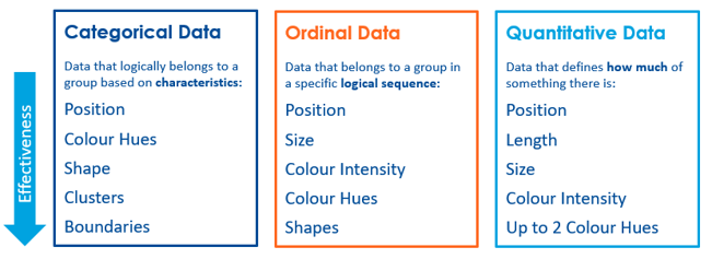
Classify visual data elements as Categorical Data, Ordinal Data, or Quantitative Data to maximize intuitive features.

Apply the most effective visual features for creating data visualizations (e.g., form, colour, position, motion) based on data classification.

Choose the Right Visual

As part of your data visualization process, align key data points with appropriate display media to comply with data visualization best practices.

A table showing data visualization best practices.
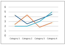
A line graph.

Line charts for creating data visualizations for time series

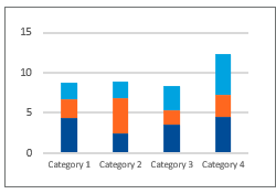
A bar graph.

Stacked bar charts for creating visuals that show the proportion to a total

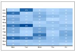
A heatmap.

Heatmaps for creating visualizations that highlight exceptionally “good” or “bad” data

Apply Appropriate Design Principles

Adopting good data visualization optimization practices helps you visualize data to effectively interpret data and gain actionable insights.

Condensed

Provide summaries and exceptional information instead of large amounts of detail.

Organized

Group related things together and arrange groups as simply as possible.

Targeted

Design specifically for your target audience and the dashboard’s objective.

Concise

Use clear, unambiguous visual features to visualize data and clearly communicate the message.